E-commerce Website Redesign
Well.ca Case Study
As the Lead Designer at Well.ca, I got to work on one of the biggest design projects at the company – redesign of the e-commerce website from wire-frames to high-fidelity designs.
The redesign was more about increasing the wallet share than just the customer base.
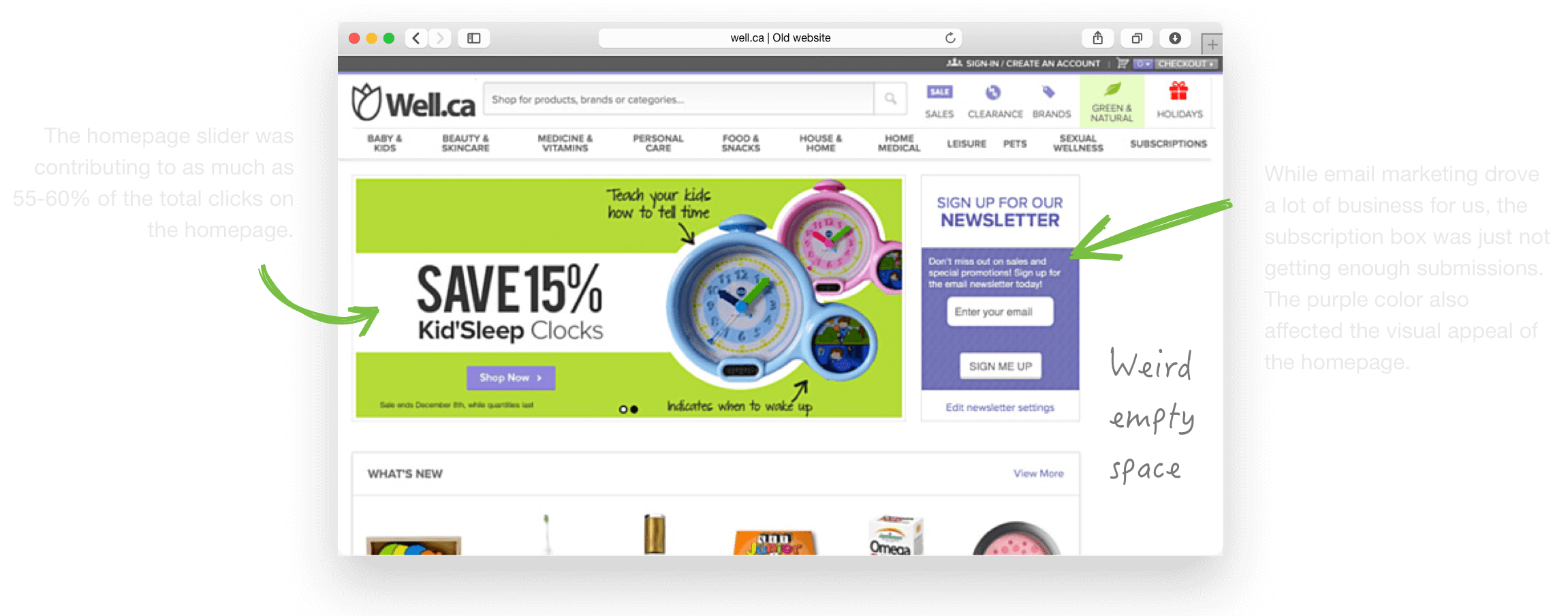
The existing website was a result of multiple iterations over a period of time, reflecting a melting pot of different design styles, UI elements and even layouts jumbled up together. While the bounce rate of the homepage was not higher than the industry average, there was a lot of content specific opportunity which would help build trust with our shoppers, contribute to the brand and thus, in the end add to our average basket size.
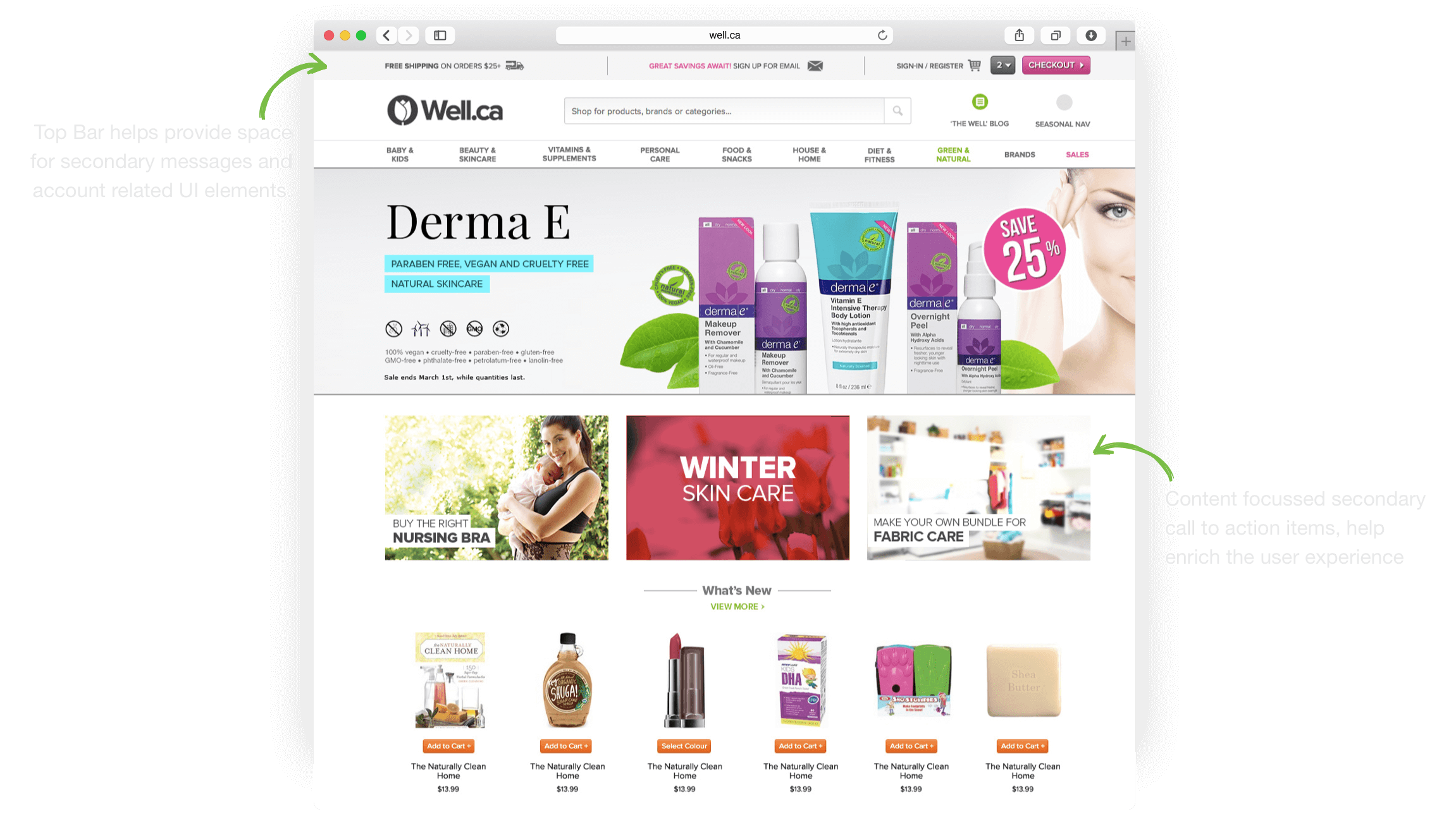
The new homepage design focussed on a clear visual hierarchy and contextual content. The content blocks below the hero banner, enriched the shopping experience with thematic categories. The top bar above the header, gave the marketers prime real estate on every page to the website, to push the latest promotions and campaigns.

The old product pages appeared to be very transactional, focussing on the product image and price. The primary CTA was far from the price and surrounded by clutter.
Avg. time: +7.18%
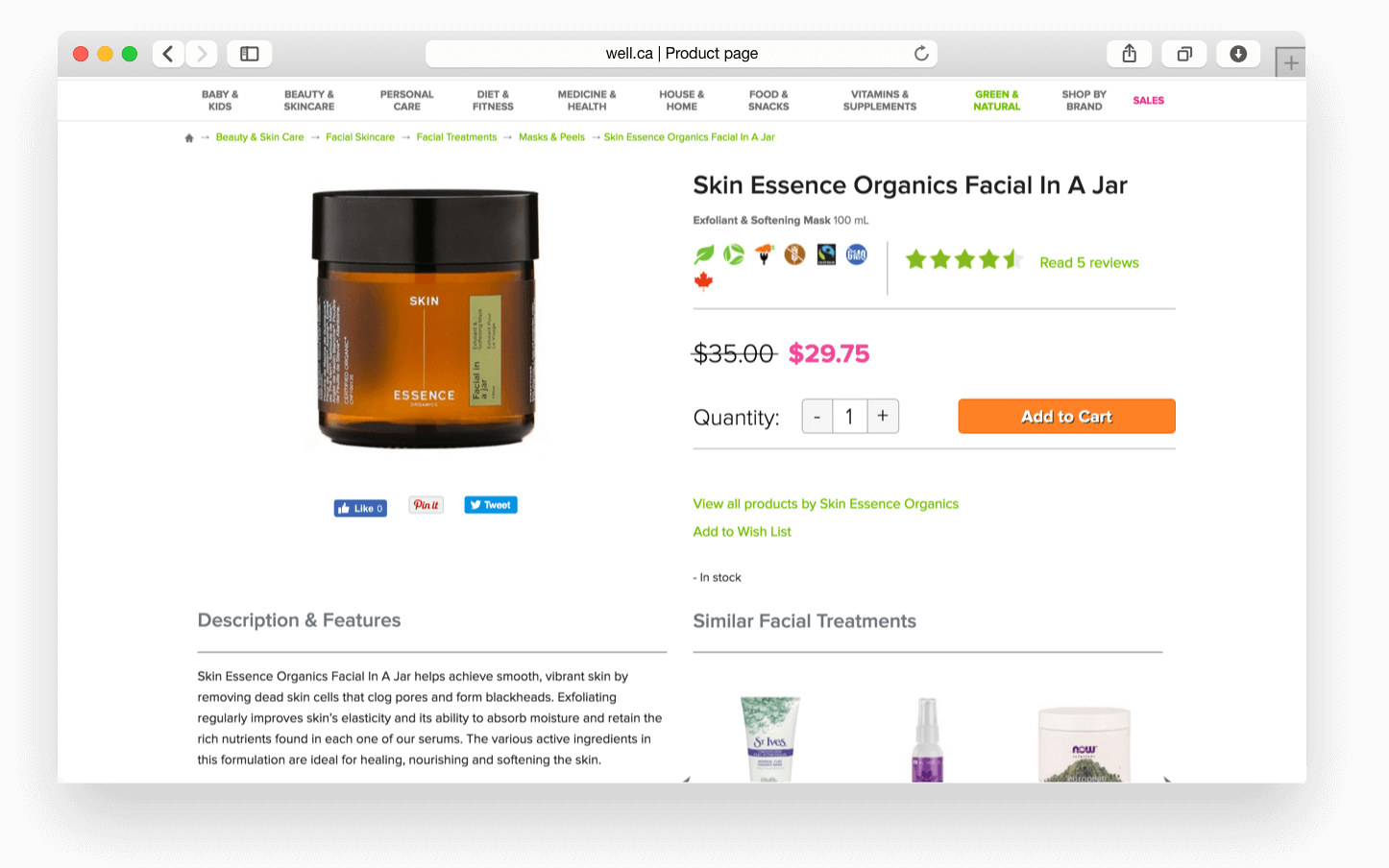
Product page is one of the most important pages for conversion. I focussed on emphasizing the product qualities (icons) along with the customer feedback (reviews) as well as a clear and visible call to action.
“The existing website was a result of multiple iterations over a period of time, reflecting a melting pot of different design styles, UI elements and even layouts jumbled up together. ”
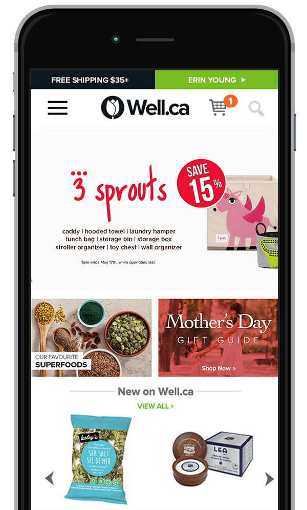
One of the major aspects of redesign was ensuring the site was responsive!
Data doesn’t lie. We knew, apart from all the e-commerce trend reports, that our customers were increasingly using mobile and tablet devices to browse the website. However, the conversion was much lower.
We ensured the redesign enabled the site to be responsive and even, adaptive in certain use cases. Redesign of the product page, category pages, filters faceting and the landing pages was a bit challenging but the results made it worth the effort.
Mobile Conversion: +32.39%
Tools used
Visual Design
I use Sketch for most of my design related tasks. Designing in Sketch, also makes it easy to export assets etc.

A/B Testing
Optimizely was really helpful in validating our assumptions about the user flow, wherever the data was not available. Designing different versions of the UI and testing them helped ensure the right decision was made.

Frontend Framework
The website front-end framework used by the agency was Bootstrap, so I worked on the same for prototyping and testing the design layouts.